fernando_ the first client is me.
THE CHALLENGE
A designer without a brand of their own sells hours, not judgement. I tell clients that a brand is decision and repetition, so mine had to be the first proof of that, not a nice profile with a logo on top.
THE SOLUTION
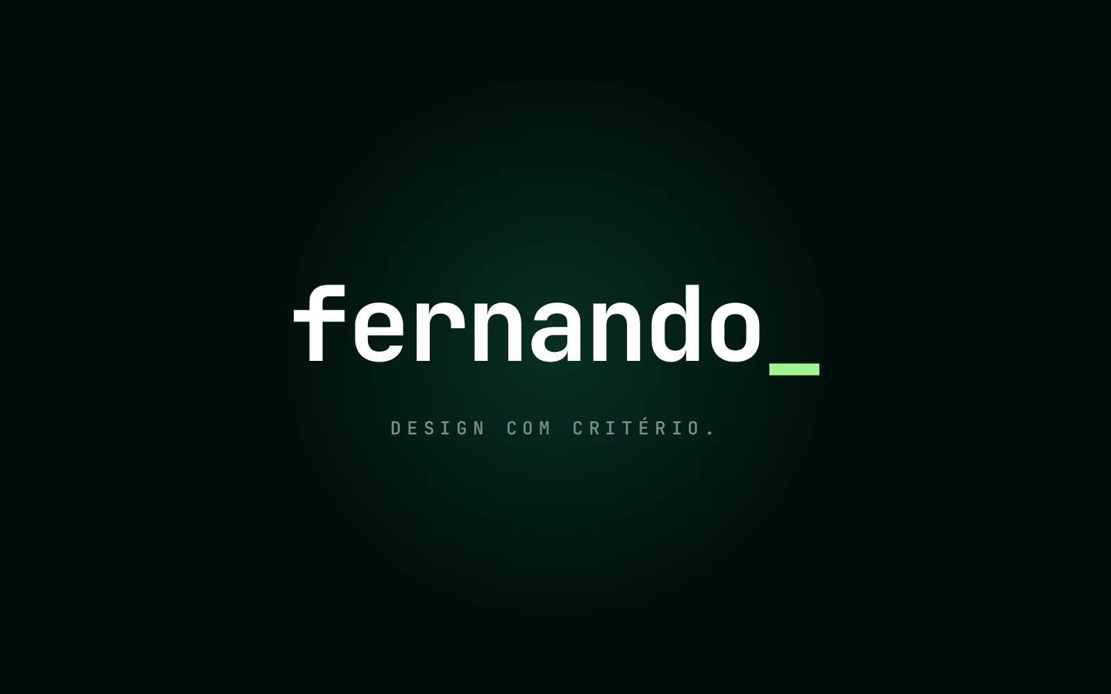
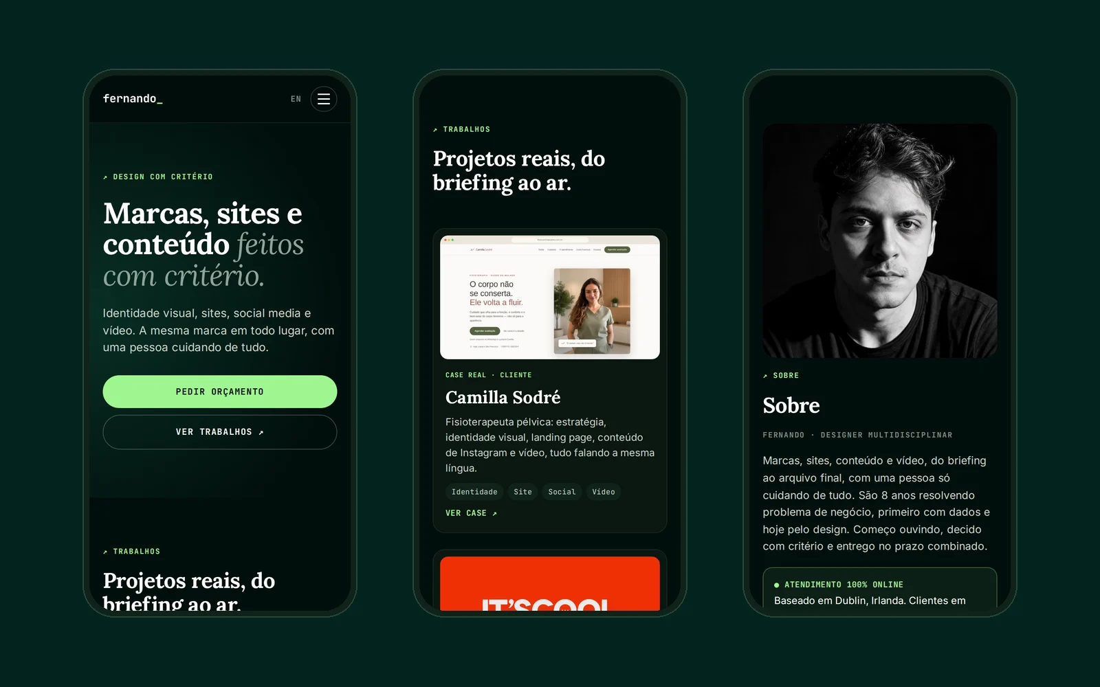
A system instead of a logo, and a website that lets the work speak first. The symbol is the underscore (the blinking cursor of someone always in the middle of a job), set in monospace because the origin is data and code, not a studio. The wordmark led to a two-mode palette with measured contrast, a type scale with line limits in pixels and an asset system with fixed series.
THE DELIVERY
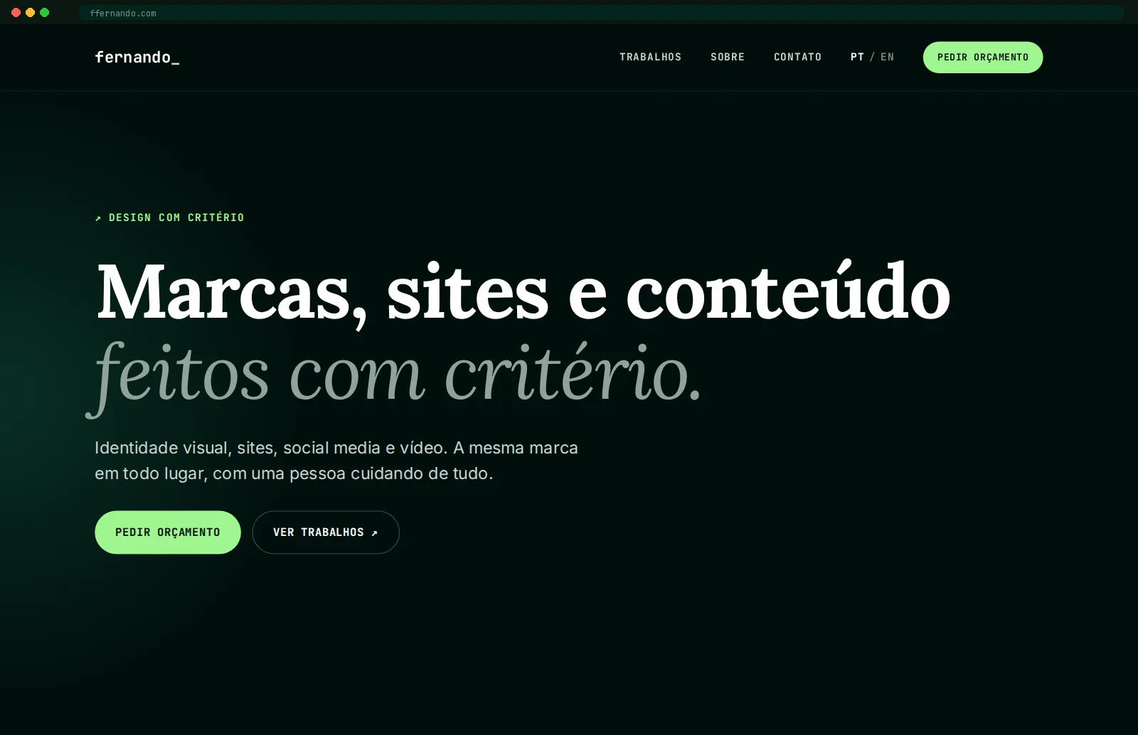
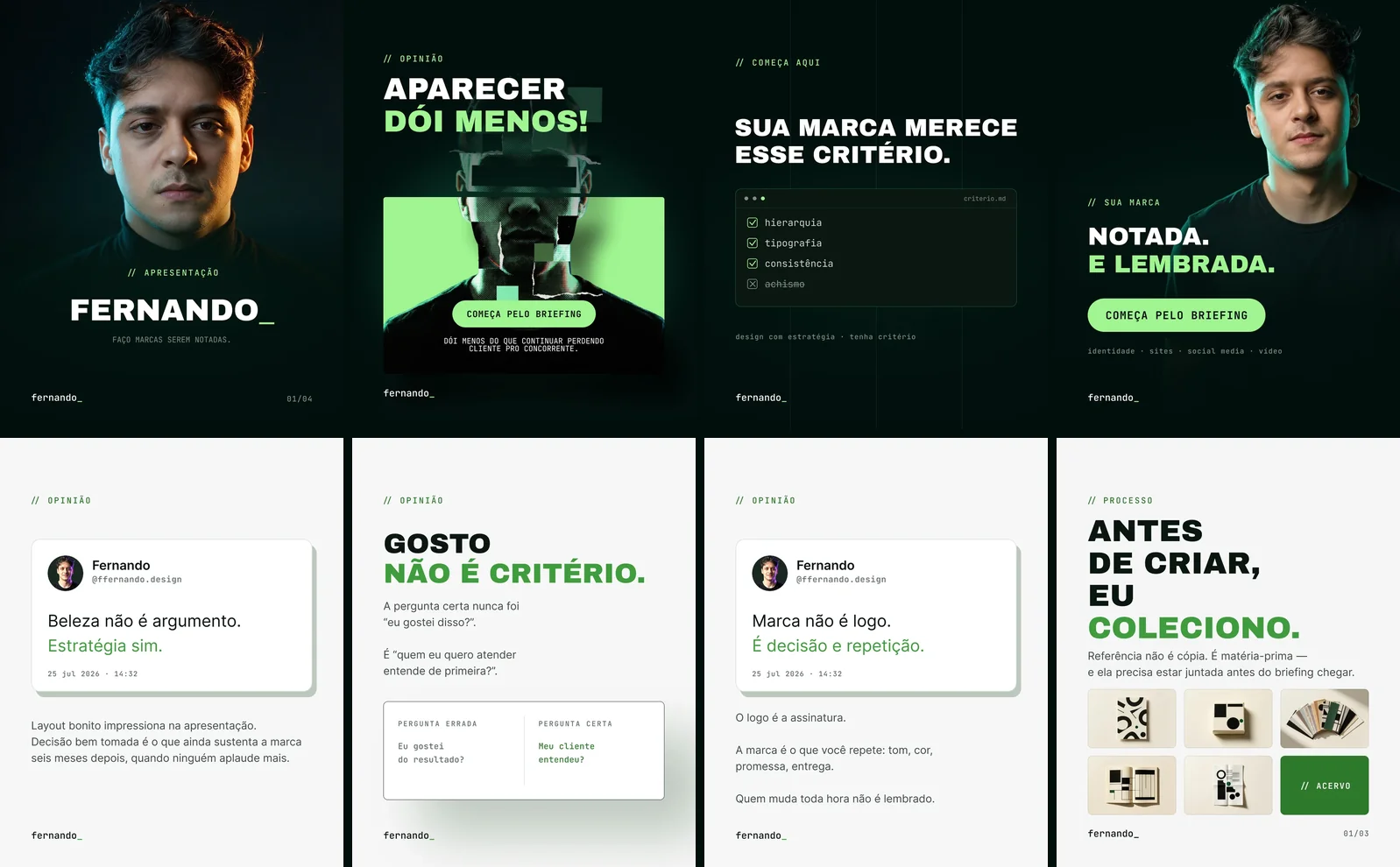
A live brand on its own domain: bilingual website with portfolio and cases, pixel and events set up. Plus a content system already in production: series with their own rules, 1080×1350 artwork and animated pieces. All of this is this website ↗
WHAT WAS BUILT
THE BRAND
THE WEBSITE
THE CONTENT SYSTEM

THE DECISIONS
The underscore is the symbol
There is no icon next to the name. What carries the brand is the cursor blinking after it: the sign of someone in the middle of a job, not someone who has finished. It's monospaced on purpose: my background is data, spreadsheets and code, and the brand doesn't fake a studio past I don't have.
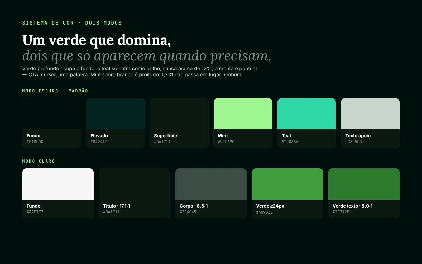
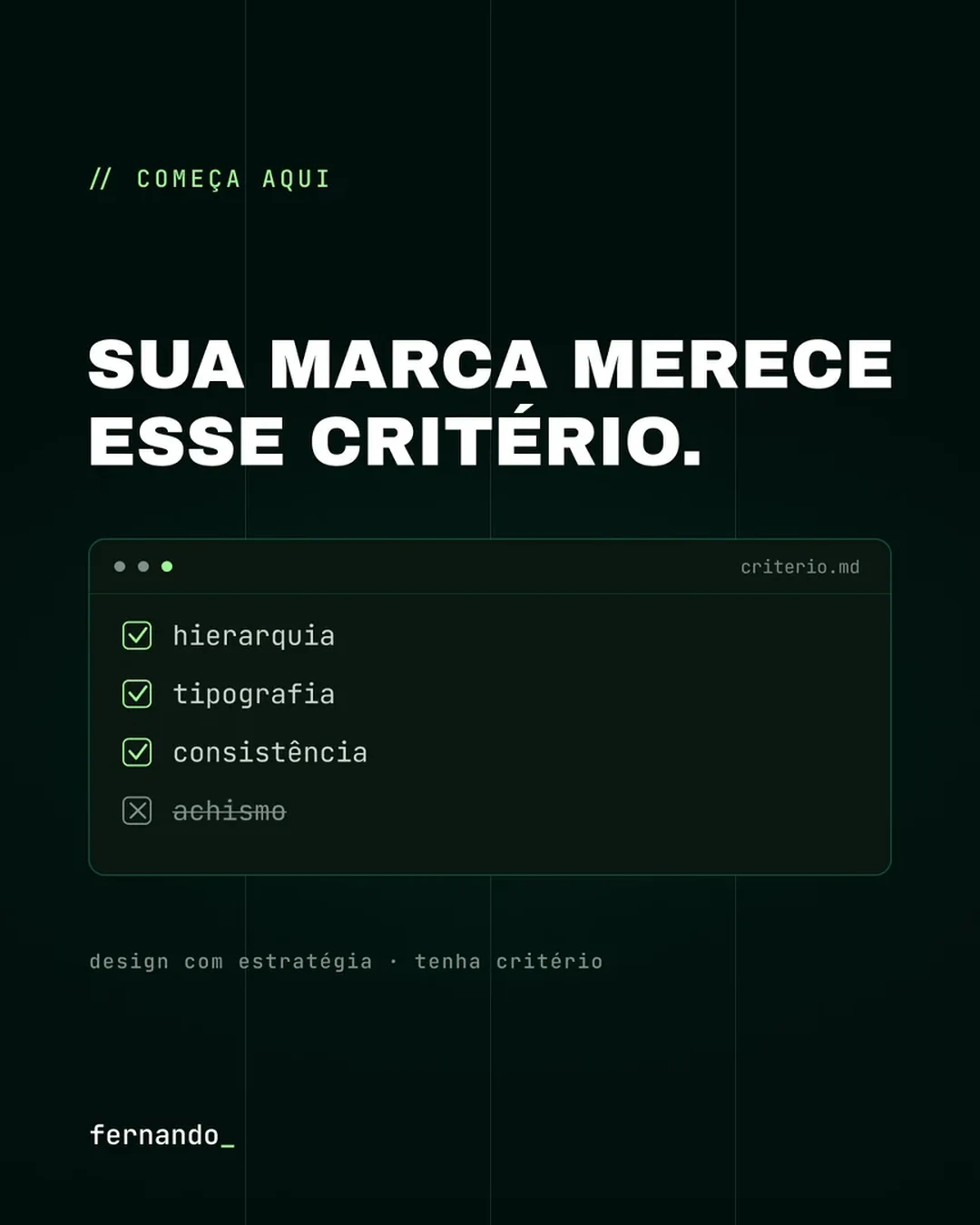
Contrast measured before the palette was closed
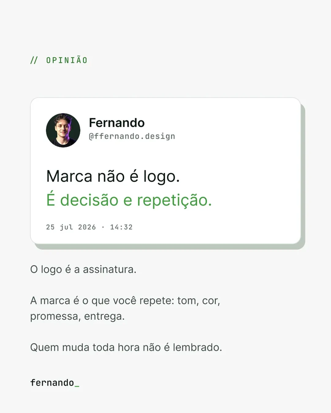
Mint is the most recognisable colour in the system and therefore the most dangerous: on white it gives 1.31:1 and was banned as text: it only lives on the deep green, in CTAs and details. Every pair in light mode went in with its number next to it: heading 17.1:1, body 8.5:1, text green 5.0:1. Measuring at the source costs an afternoon; finding out at publishing costs the whole layout.
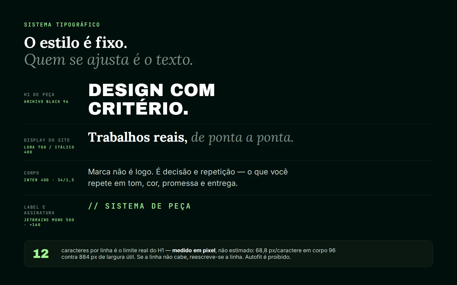
The style is fixed, the text adapts
The H1 on every piece has 12 characters per line (not an estimate, a measurement: 68.8 px per character at size 96 against 884 px of usable width). When the sentence doesn't fit, the sentence is rewritten. Autofit and shrink-to-fit are banned, because a piece with its type shrunk to fit shows, in the feed thumbnail, exactly the hesitation it should hide.
Series, not one-off posts
Content is organised in series with their own rules (REPERTÓRIO, FERRAMENTAS, COMO EU FARIA), each with a fixed label, slide count and signature. A series is what turns volume into memory: whoever saw the second edition recognises the fifth without reading the name, and I stop deciding from scratch what to post every week.