Camilla Sodré a brand from scratch to launch.
THE CHALLENGE
Good content, inconsistent packaging. Camilla had presence, training and a way of listening her patients praised, but the brand conveyed none of it. Pelvic physiotherapy still carries a taboo: patients usually arrive after years of being told that pain is normal. The communication had to deal with embarrassment before it could sell a treatment.
THE SOLUTION
Positioning first, artwork second. The territory became Flow (the body isn't fixed, it flows again). From there came the identity, the rosé and sage palette, the type system, a conversion landing page, a carousel system and video guidelines. One territory decision that organises every other one.
THE DELIVERY
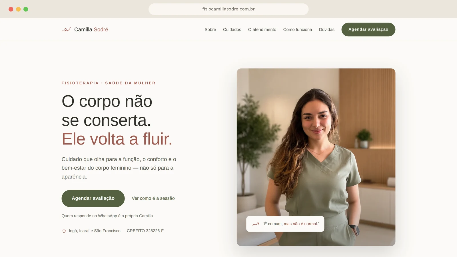
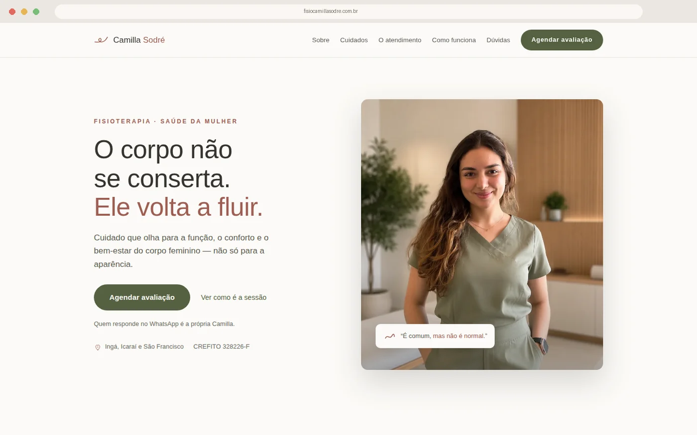
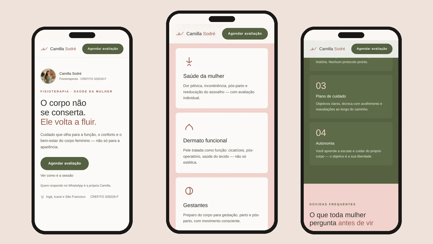
A coherent brand, ready to scale: recognisable without the logo, with templates that speed up production and a landing page that is published, responsive and live: see it now ↗
WHAT WAS DELIVERED
THE SYMBOL
COLOUR, TYPE AND PHOTOGRAPHY
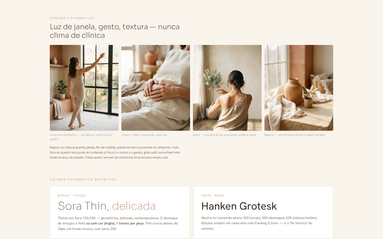
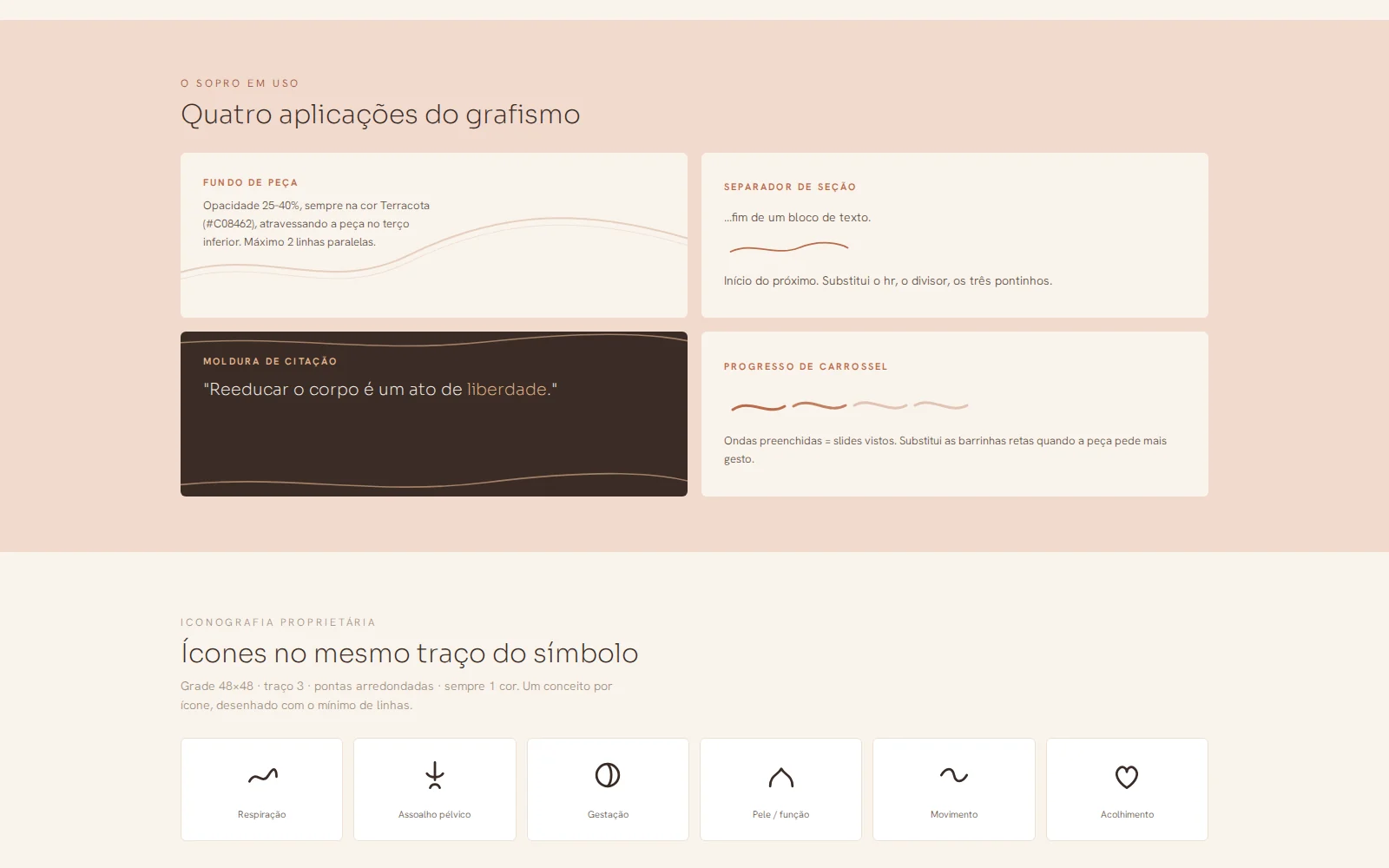
THE GRAPHIC LAYER
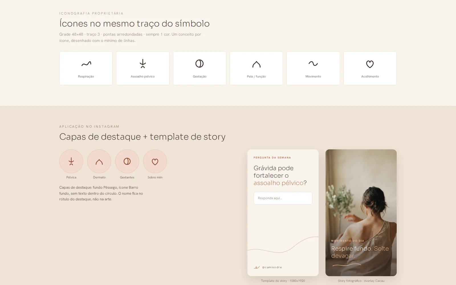
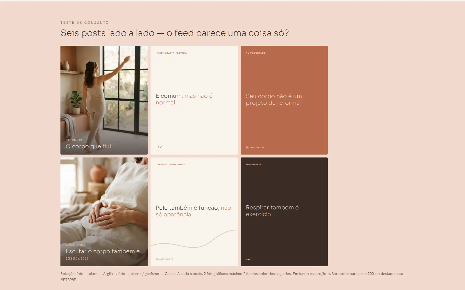
THE FEED SYSTEM
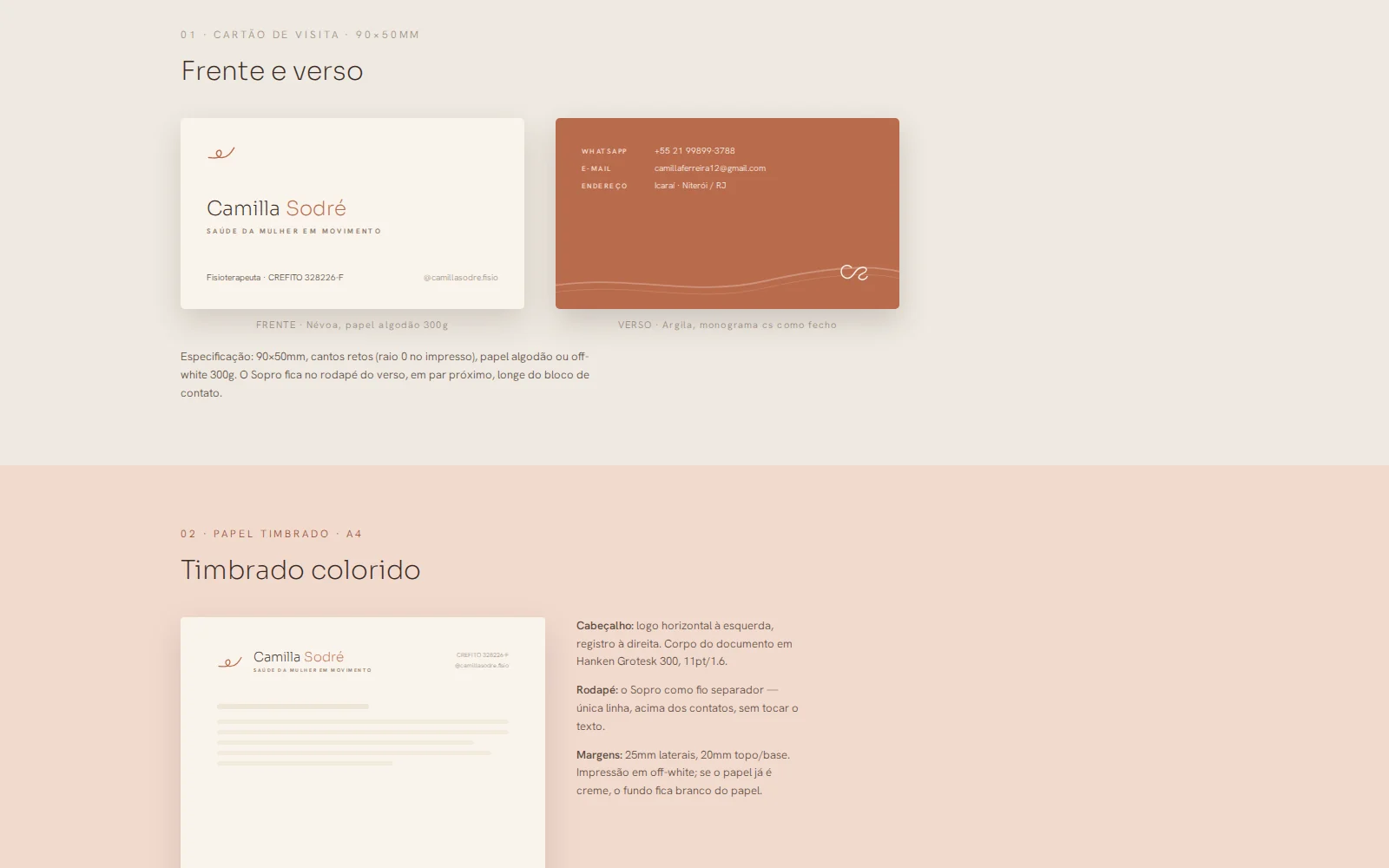
THE STATIONERY
THE LIVE WEBSITE
THE DECISIONS
The territory came before the palette
The first deliverable wasn't artwork, it was a sentence: "the body isn't fixed, it flows again". It defines what the brand says and what it refuses to say: no before-and-after, no language of repair. With the territory settled, colour, type and scripts stopped being a matter of opinion.
Earthy palette instead of clinic pink
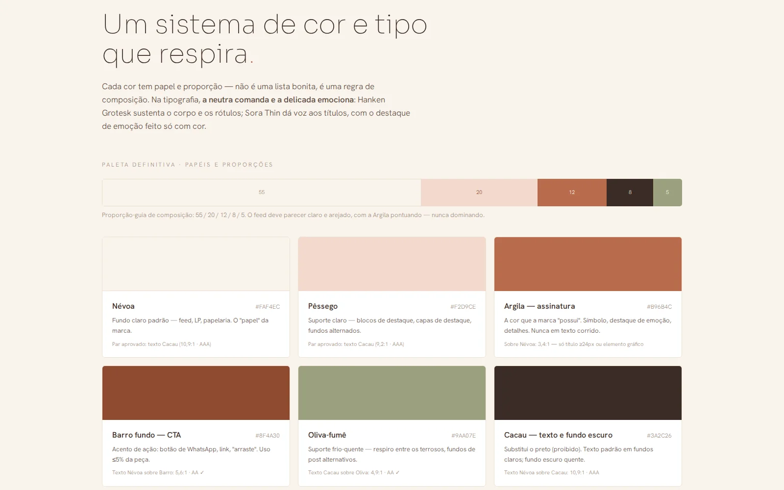
Women's health has a default pink that says "feminine product", not "health professional". The palette went to mist, peach, clay and cocoa: welcoming without being childish, and it works both in the clinic and on a phone screen.
Contrast checked before the palette was closed
Cocoa on mist gives 10.9:1 and passes AAA. Clay on mist gives 3.4:1 and can only appear above 24px or as a graphic element. Setting this at the source avoided finding out at publishing time that half the text was unreadable.
Three symbol routes, decided at 110 pixels
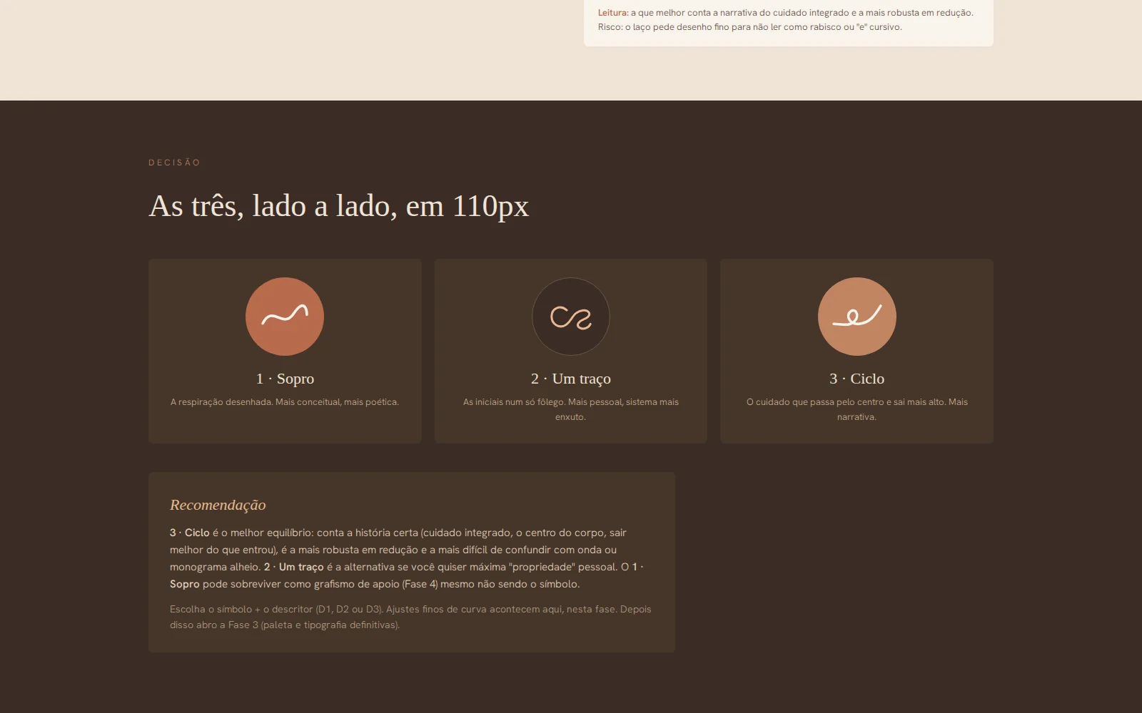
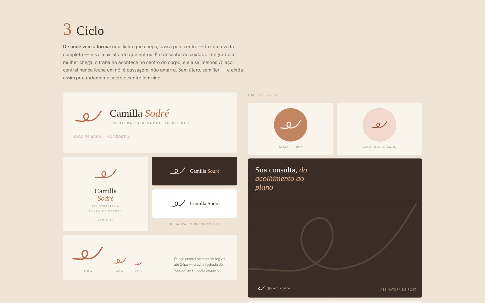
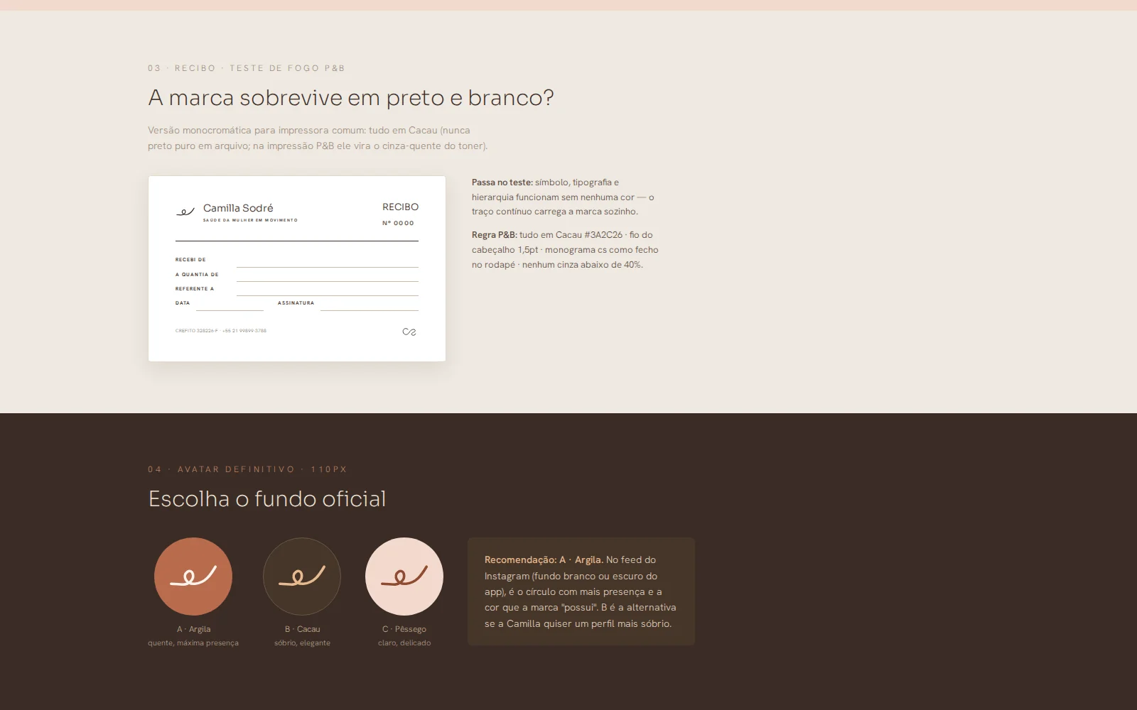
Breath, One Stroke and Cycle were fully drawn and compared at the size the brand really appears: 110 px, the Instagram avatar. Cycle won: the line that comes in, passes through the centre and leaves higher than it entered. A symbol that only works large isn't a symbol, it's an illustration.
A brand that survives the photocopier
Before sign-off, the logo went through the black-and-white receipt test: no colour, no gradient, printed crooked on plain paper. It's a clinic's worst real scenario, and it's what keeps the brand legible on the stamp, the letterhead and the PDF a patient prints at home.
Landing page before the profile
The choice was to publish the website first and only then build the content system. An Instagram profile with no destination sends traffic nowhere; with the page live, every post had somewhere to point, and WhatsApp became the only conversion path, with no form in between.