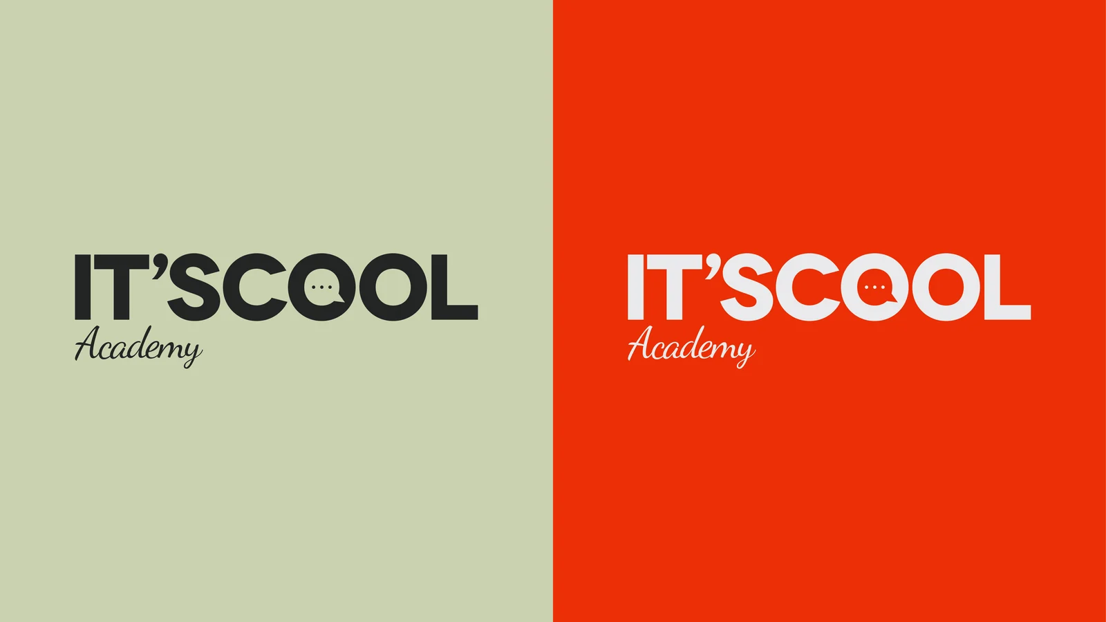
It's Cool Academy the symbol was inside the name.

THE CHALLENGE
An online language school with no brand. André taught well and had students, but It's Cool was just a name: no symbol, no colour, no voice. And its place in the market is tight: on one side the traditional school, formal and grammar-driven; on the other the language app, cheap and impersonal. The audience is adults aged 25 to 55 who need the language to get promoted or move abroad, people who want neither.
THE SOLUTION
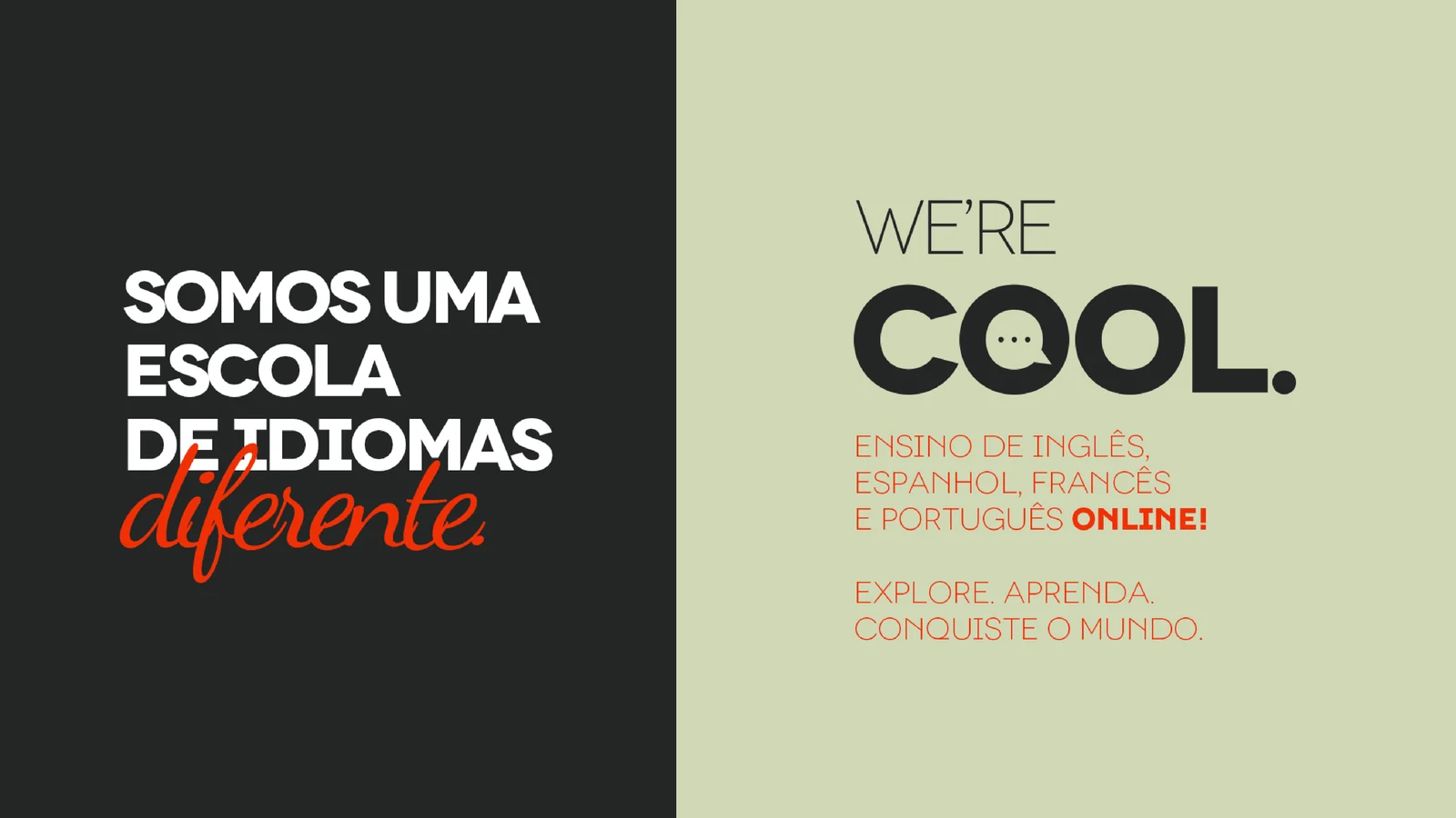
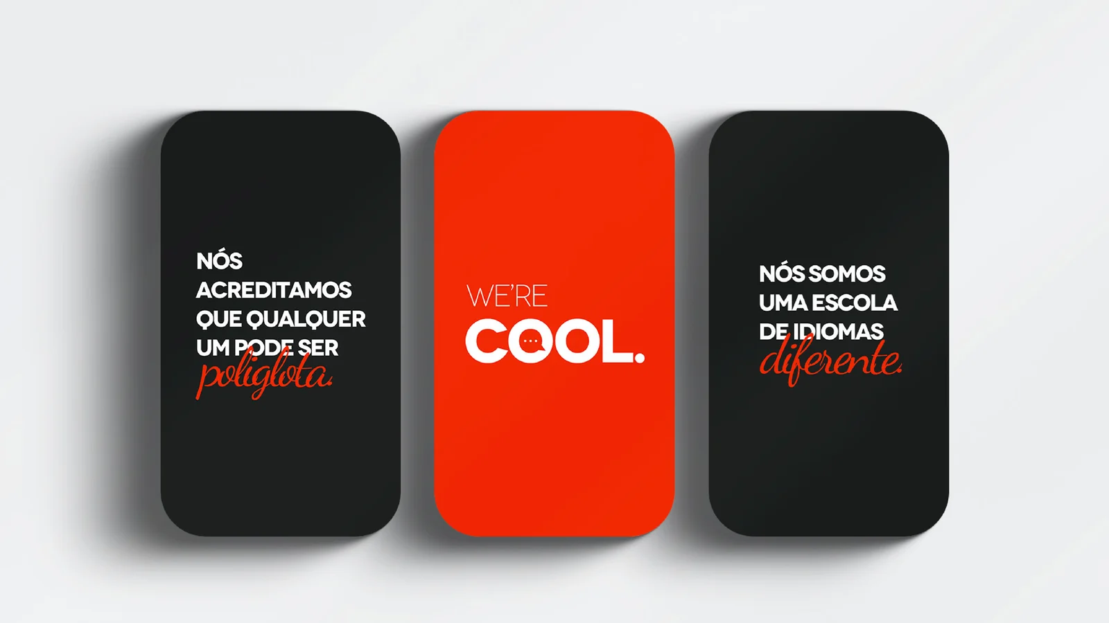
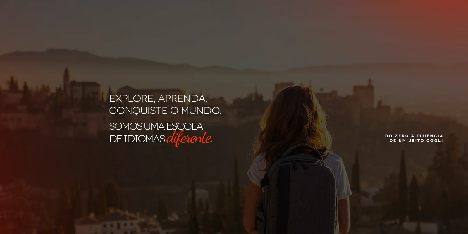
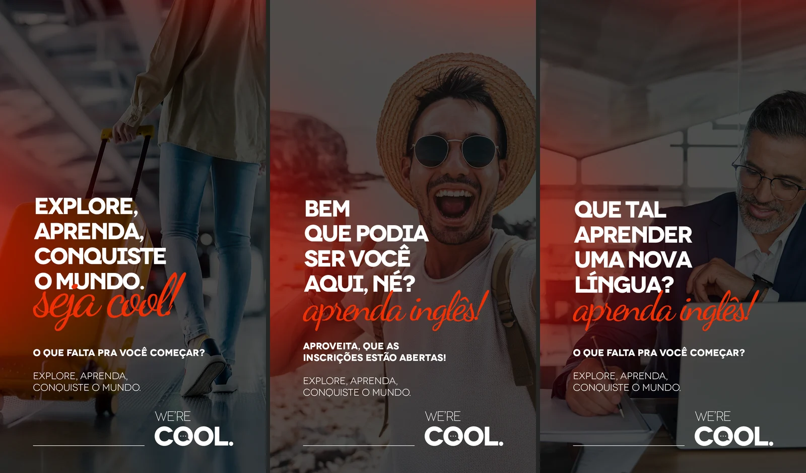
The brief came with a tough requirement: "the brand has to be seen even without its name written". The answer wasn't to invent an icon next to the logo, it was to find the symbol inside the word. The two O letters in COOL became a speech bubble with an ellipsis. Everything came from that drawing: palette, badges, pattern, tone of voice and the layout grid.
THE DELIVERY
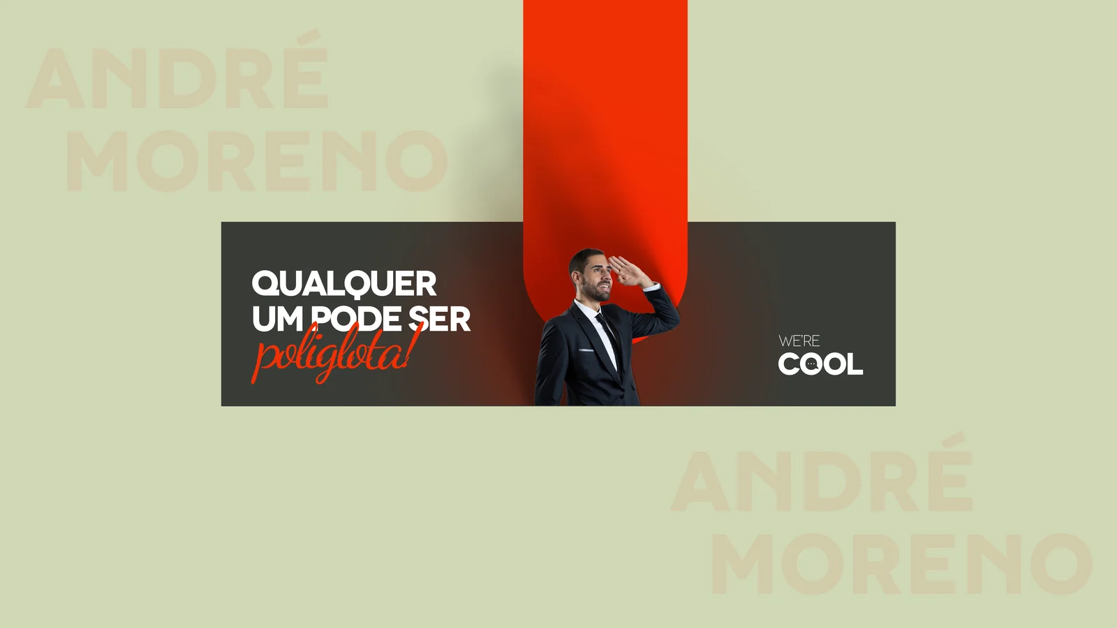
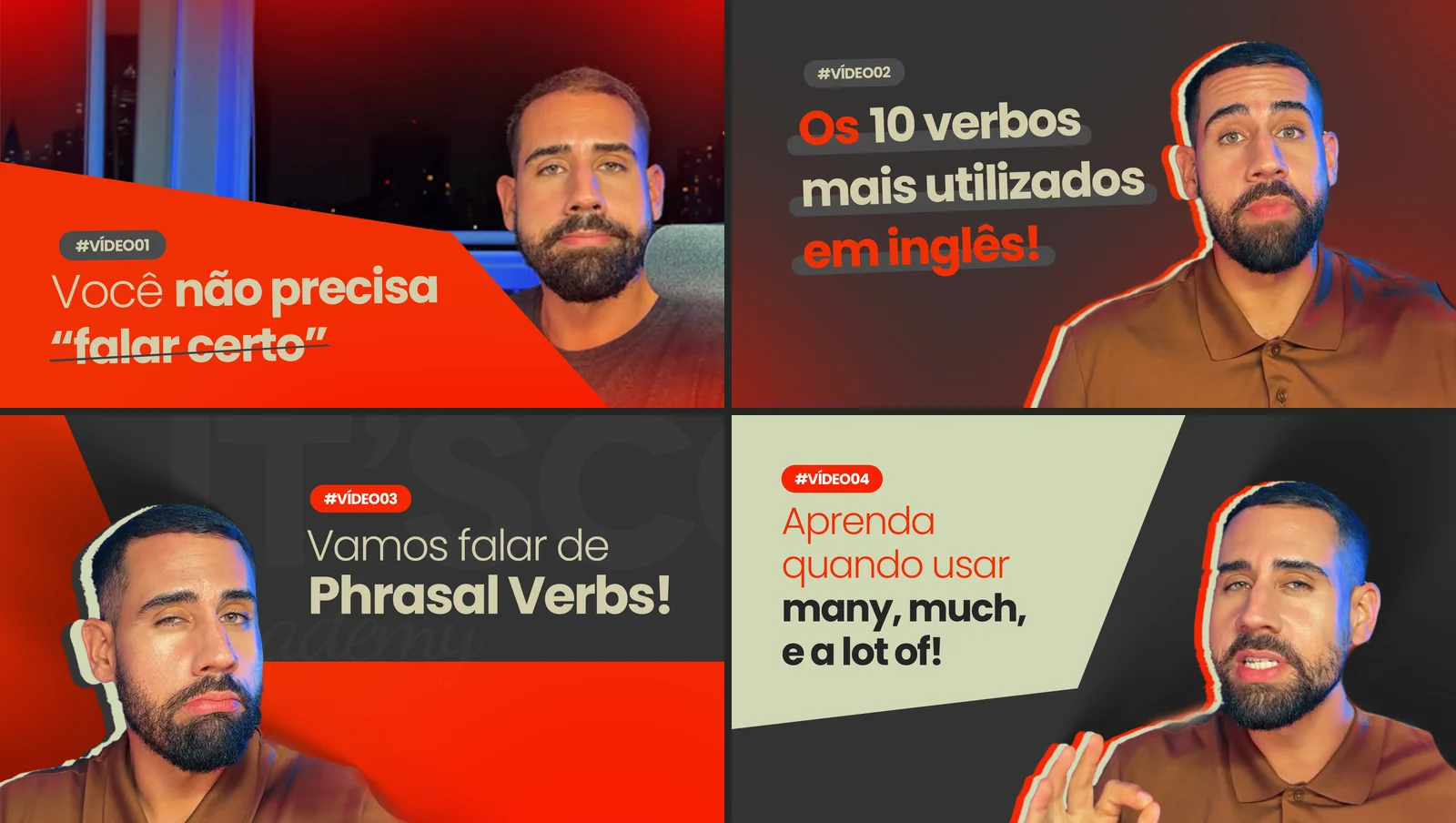
A system, not a logo. Thirteen requests delivered across nine fronts: brand presentation, student and teacher onboarding, LinkedIn and YouTube kit, motion intro and lower thirds, editorial calendar, feed and stories posts, certificate. All of it coming from the same original decision.
WHAT WAS DELIVERED
THE SYSTEM
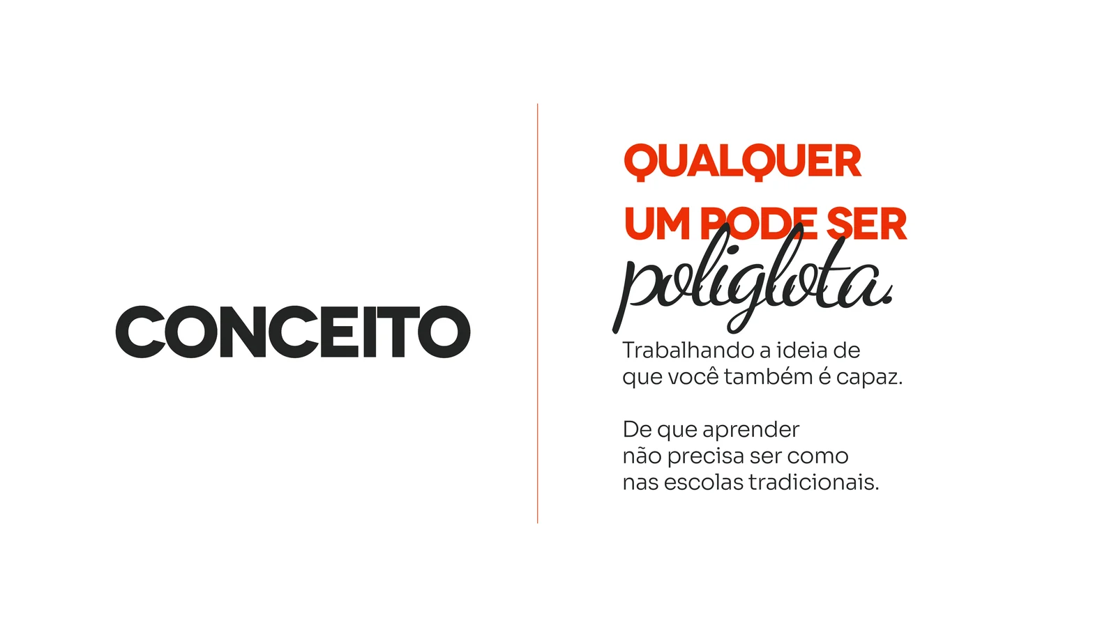
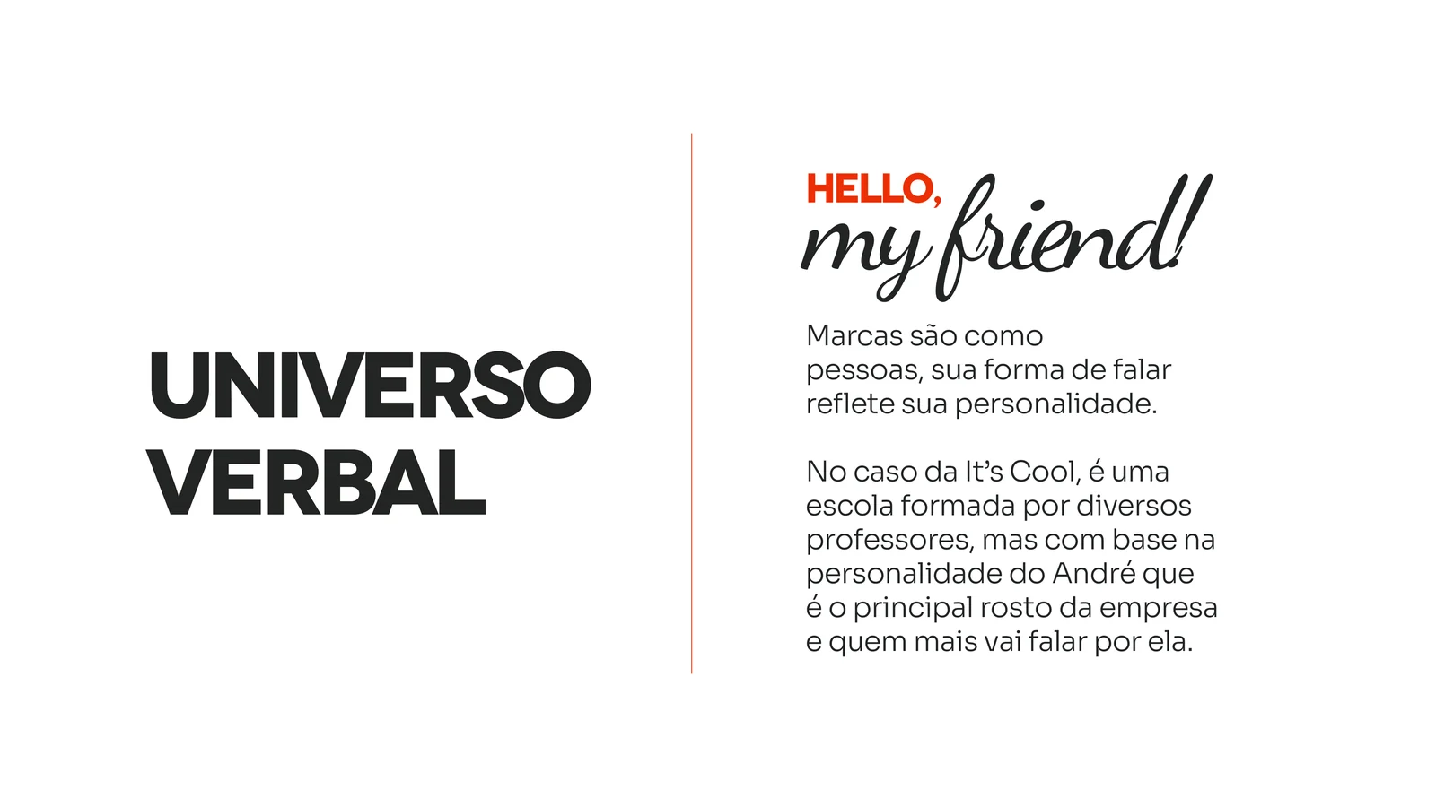
THE CONCEPT AND THE VOICE
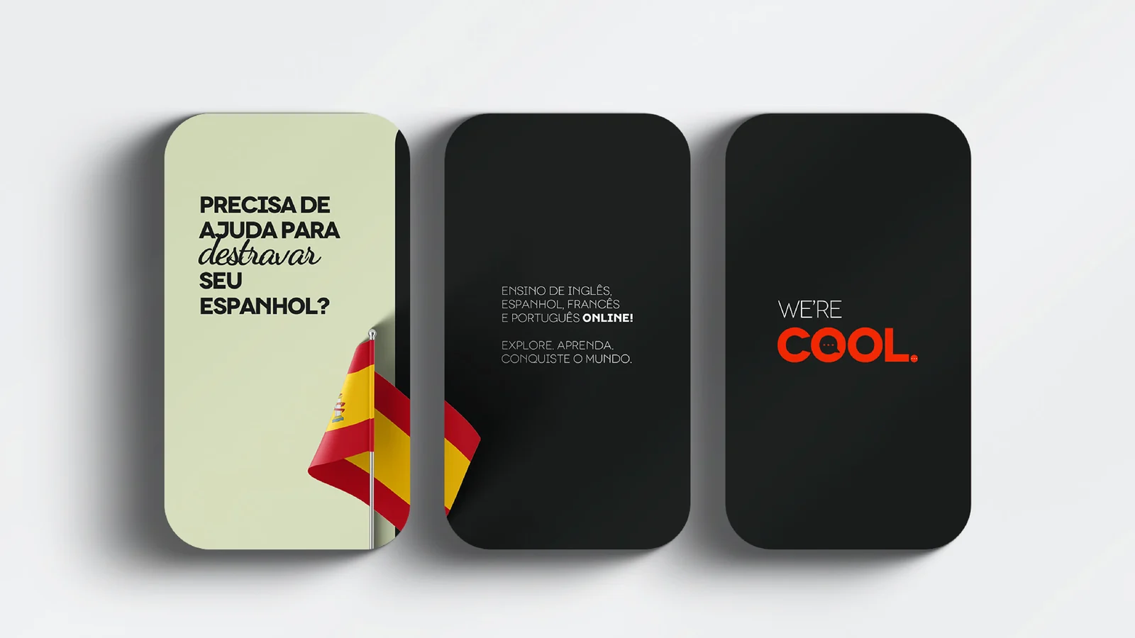
THE APPLICATIONS
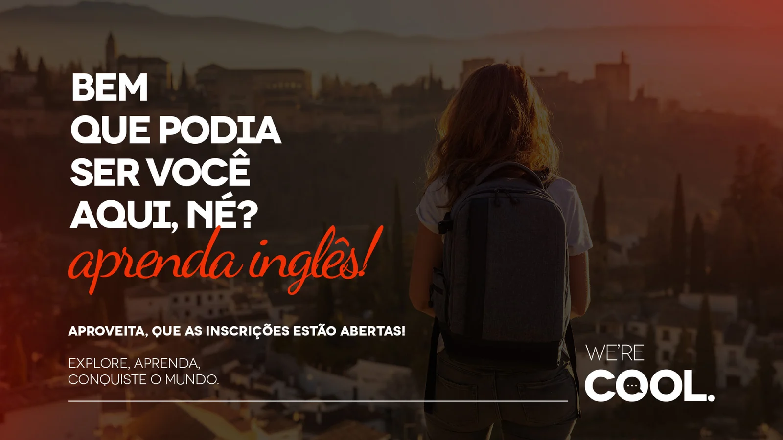
THE VIDEO AND SOCIAL KIT
THE FEED


THE DECISIONS
The symbol came from inside the name
The brief asked for a brand recognisable without its name written. Instead of drawing an icon next to the logo, the two O letters in COOL became a speech bubble with an ellipsis. The school sells conversation: the symbol now says that on its own, and the logo has one less thing to carry.
Orange and sage, not language-school blue
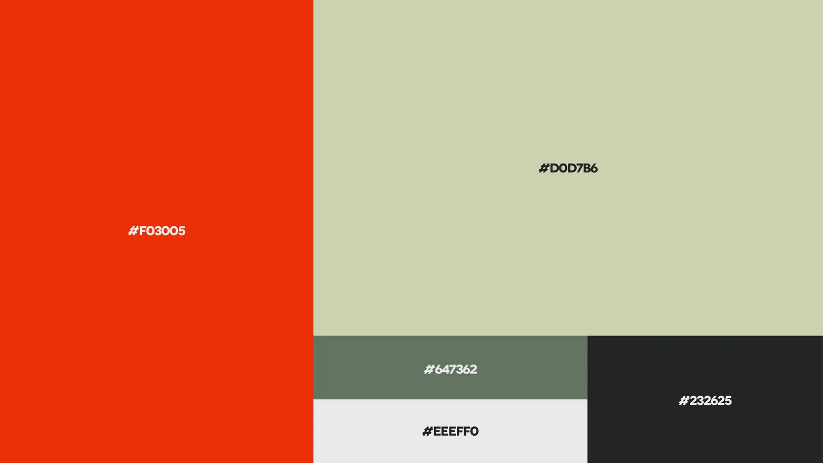
Language courses have a default institutional blue that says "educational institution". The palette went to a warm red-orange over a cool sage green, with graphite in support: far from the traditional school without falling into app-style colour. Colour was the first decision after the symbol, because it was the thing that had to stick in memory.
Naming the audience before planning the content
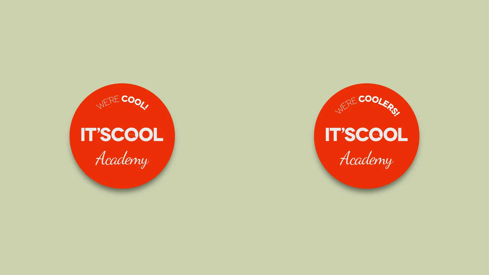
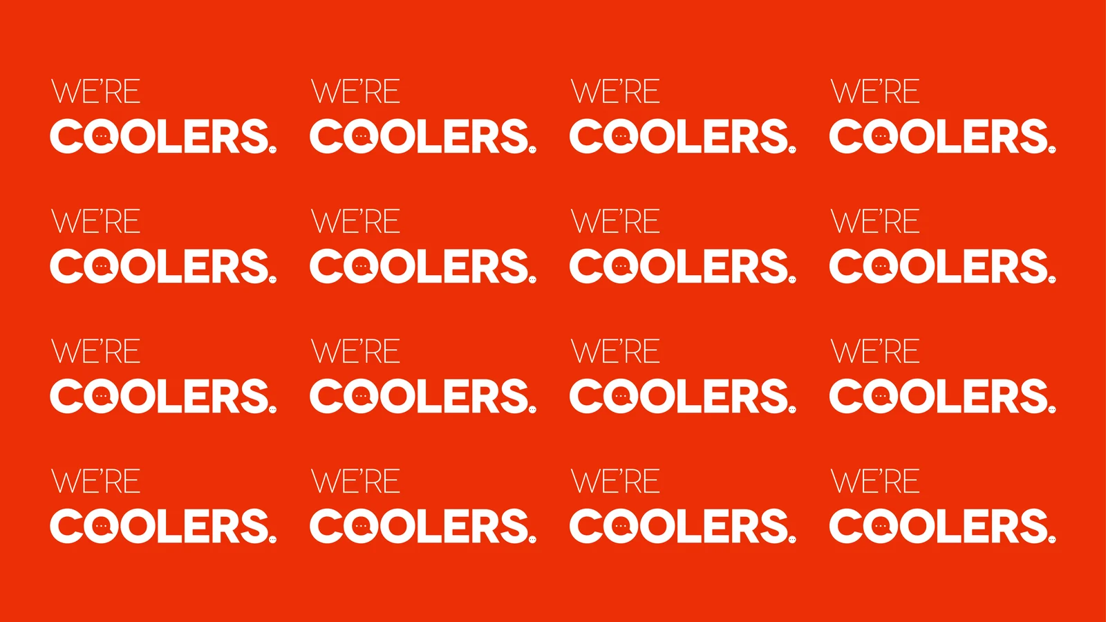
Students became coolers. It isn't decoration: "WE'RE COOLERS" became a badge, a pattern, a post theme and an approval criterion for every piece. An audience with its own name gives the editorial calendar an axis that survives a change of writer.
The speech pill as the layout grid
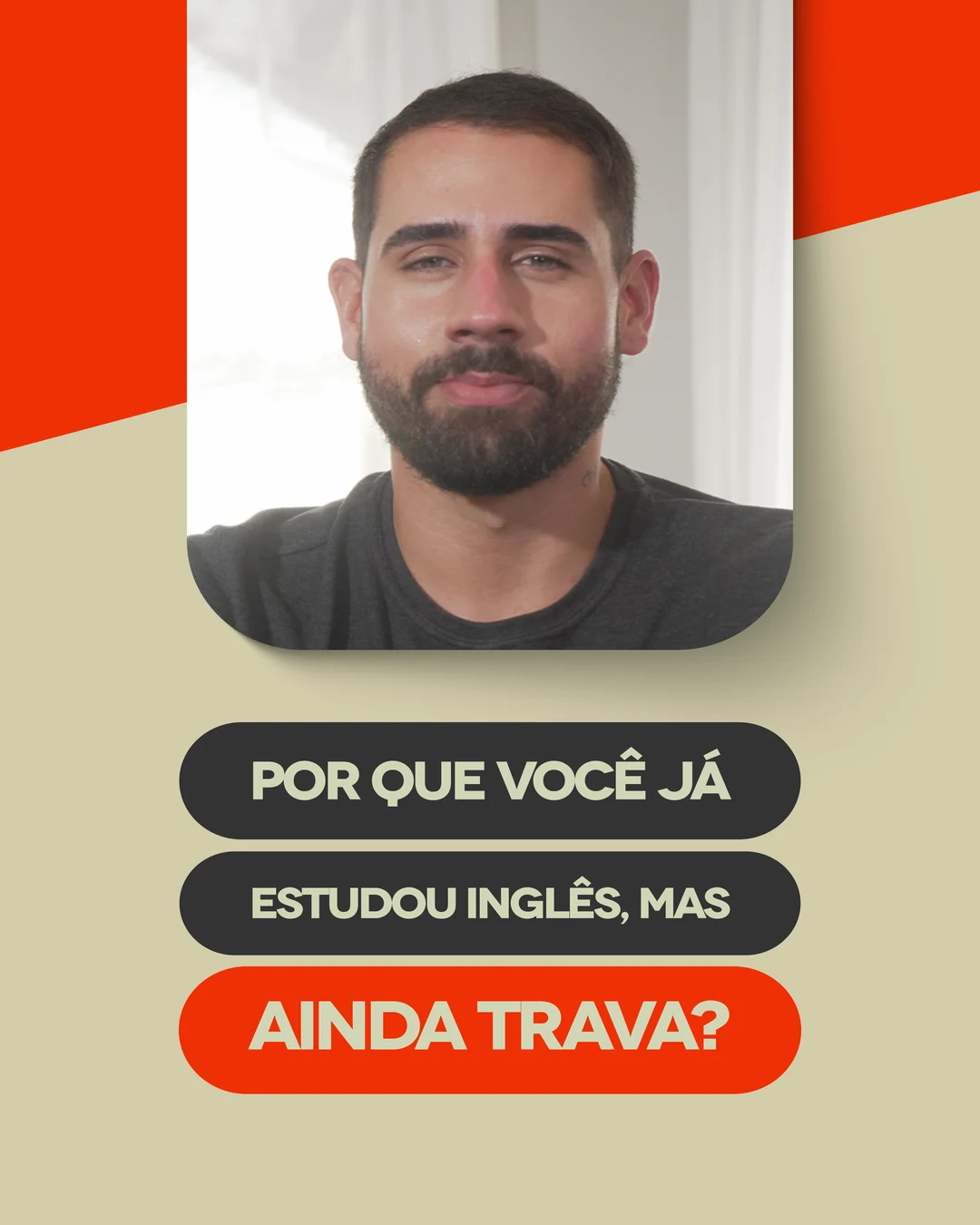
Feed copy sits in rounded pills stacked like steps, with the last one in orange. It's the logo's bubble, repeated at post scale. In practice the post is recognisable as a feed thumbnail before any text is read, which is where the fight for attention really happens.
Deliver open files, not a PDF of rules
Logo, badges, pattern and palette were delivered as SVG, on top of the presentation. Guidelines that only exist as a PDF become reference; a system that exists as vectors becomes production. That's what let the client keep applying the brand to new pieces without depending on me for each one.